
“Yes, visuals are important to a presentation. Very important. So, let’s add some. As a matter of fact, let’s add a lot of visuals. We will fill each slide with lots of visuals. That way the audience will have something to look at while I’m talking. After all, visuals help the audience remember the content, and I have a lot of important information to share. Statistics, yearly projections, sales, revenue, costs, leads, prospective new accounts, EBITDA… Wait, do they even know what that is? Ok, I’ll need a few slides to explain that, too. Charts, tables, graphs infographics. I have a lot of new members to introduce also. I can build a slide with their pictures, each with their whole life story, from birth until yesterday when they spilled their entire cup of coffee on the Sales Report, right before the meeting. That will make a good story! The audience will love it! Bullet points…. I’m going to need lots of them. Maybe 8 or 10 slides of bullet points, in complete sentences, so the audience knows exactly what I mean without any confusion. I wonder if my speech can just be copied and pasted into the presentation? That way I can be sure the audience has ALL the information and doesn’t miss anything. After all, the best way to retain information is to hear it and visualize it at the same time. Right??? Yes! I’m going to be prepared this year, with lots and lots of visuals to make my presentation the best one yet!“

It’s true, you need visuals to make your presentation more interesting and to emphasize the important content that you want the audience to remember. But too much information on the screen, too many visuals on one slide, gives your audience a lot to look at and too much to read, causing sensory overload. This is exhausting.
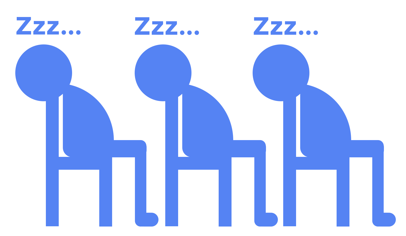
You don’t want your audience looking like this…
Instead, you want them to be enthusiastic, attentive, and excited. More like this…

“A picture is worth a thousand words”. Let’s say that again… “A PICTURE IS WORTH A THOUSAND WORDS”. This couldn’t be any more true. 90% of all information transmitted to the brain is visual, processing those images at a rate 60,000 times faster than text. So, let’s replace those “thousand words” with a graphic or image, allowing the audience to absorb more information. This will increase information retention and save your designer’s fingers.

Most presenters show highly complex data such as financials, demographics, company goals, etc. That’s a lot of numbers you’re throwing at them. It is important for the audience to retain what you are saying, so why not emphasize the important takeaways with a graphic or two, giving visual pop to the bottom line. Let’s face it, there’s always some information that needs to be shared, that even the best presenter in the world couldn’t make exciting. So how do you make the content more engaging so your audience doesn’t see this as an opportunity for a bathroom break? Create a captivating graphic that illustrates the information in an easy to understand and interesting manner, to emphasize the meaning of what you are trying to say.
The use of graphics in a presentation has three main goals:
- Elicit feelings, drawing on the emotions of your audience
- Encourage your audience to take action
- Leaving your audience with an understanding of the content you just presented using informative visuals
Exciting and informative graphics done in a clear and simplified way, complimenting your presentation rather than transcribing it on the slide, will keep your audience’s attention, allowing you to demonstrate your energy and enthusiasm about the content. This will make them more enthusiastic and excited to be there, instead of falling asleep in their seats.
Related Posts

From Great Idea to Golden Reality
One thing I love about working on a creative team is that it doesn’t matter…


Six Benefits of Refreshing Your Website
As your company continues to evolve, your website must represent your latest…